Company:
abhome.gr
abhome.gr
My Role:
Graphic Design
Services Provided:
Brand Identity
Copywriting
Year:
2020
Graphic Design
Services Provided:
Brand Identity
Copywriting
Year:
2020
Overview:
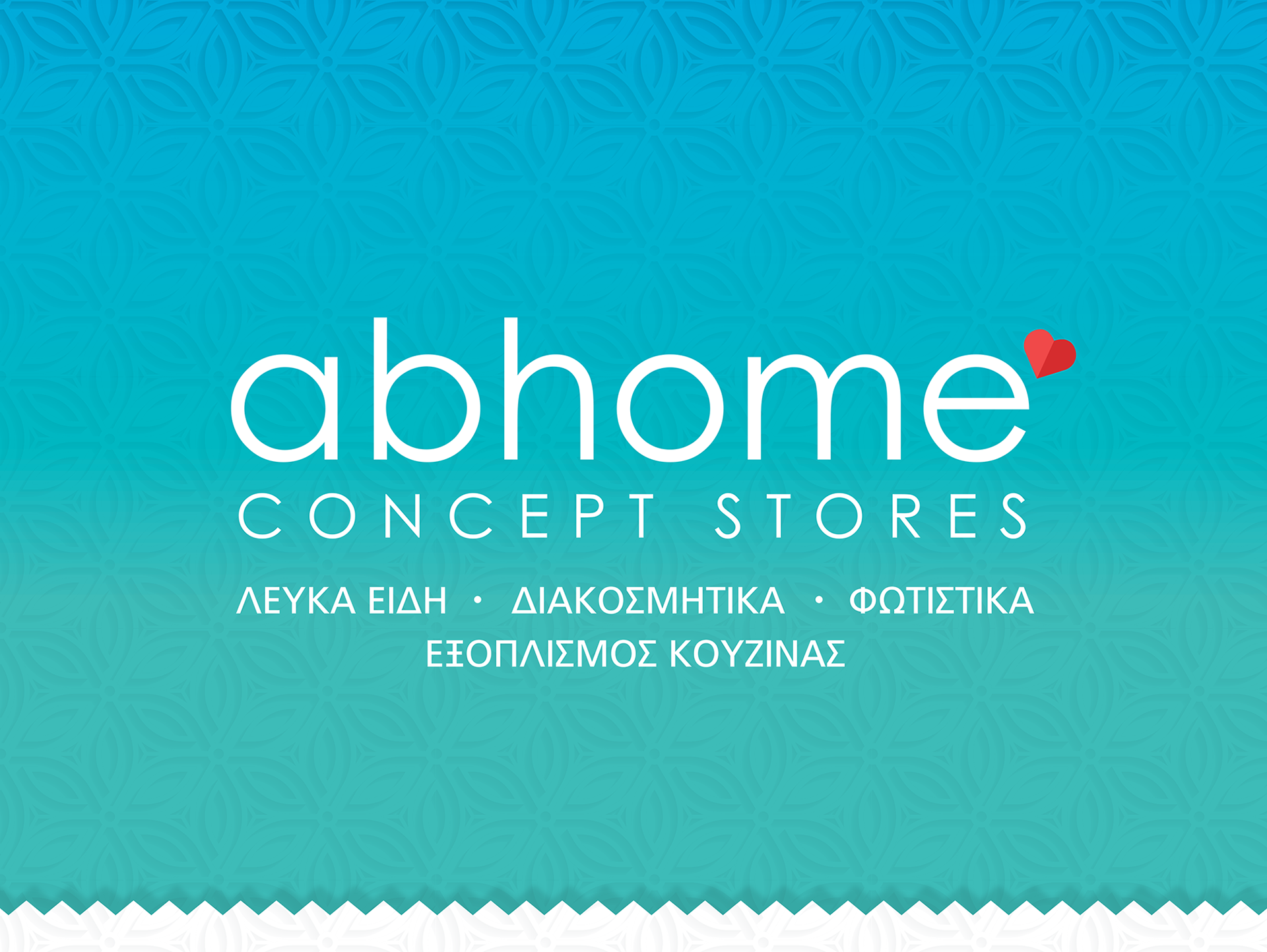
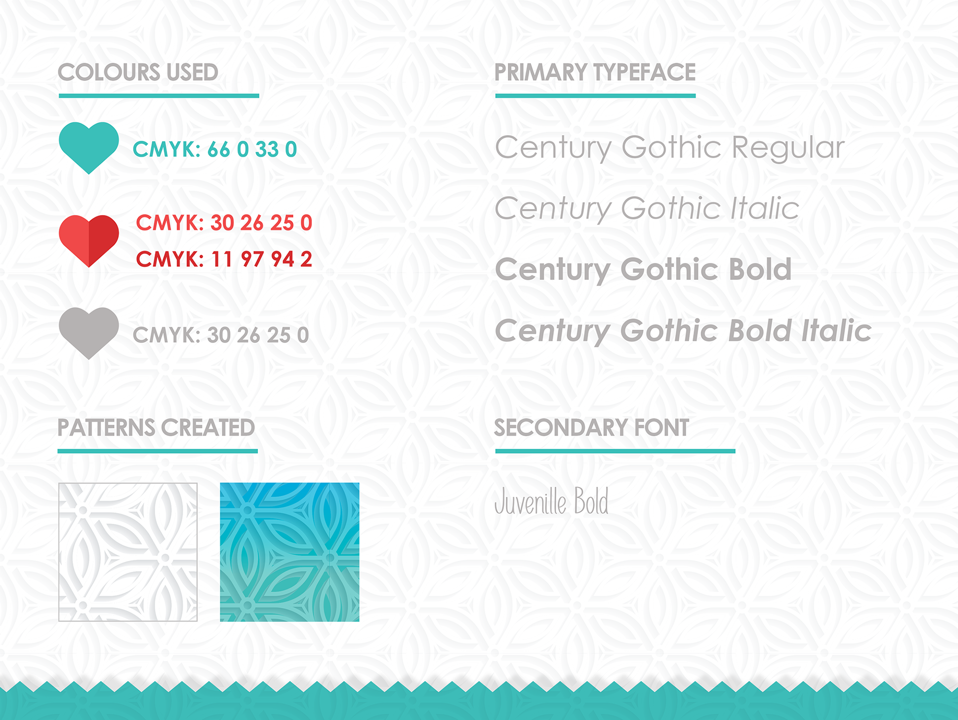
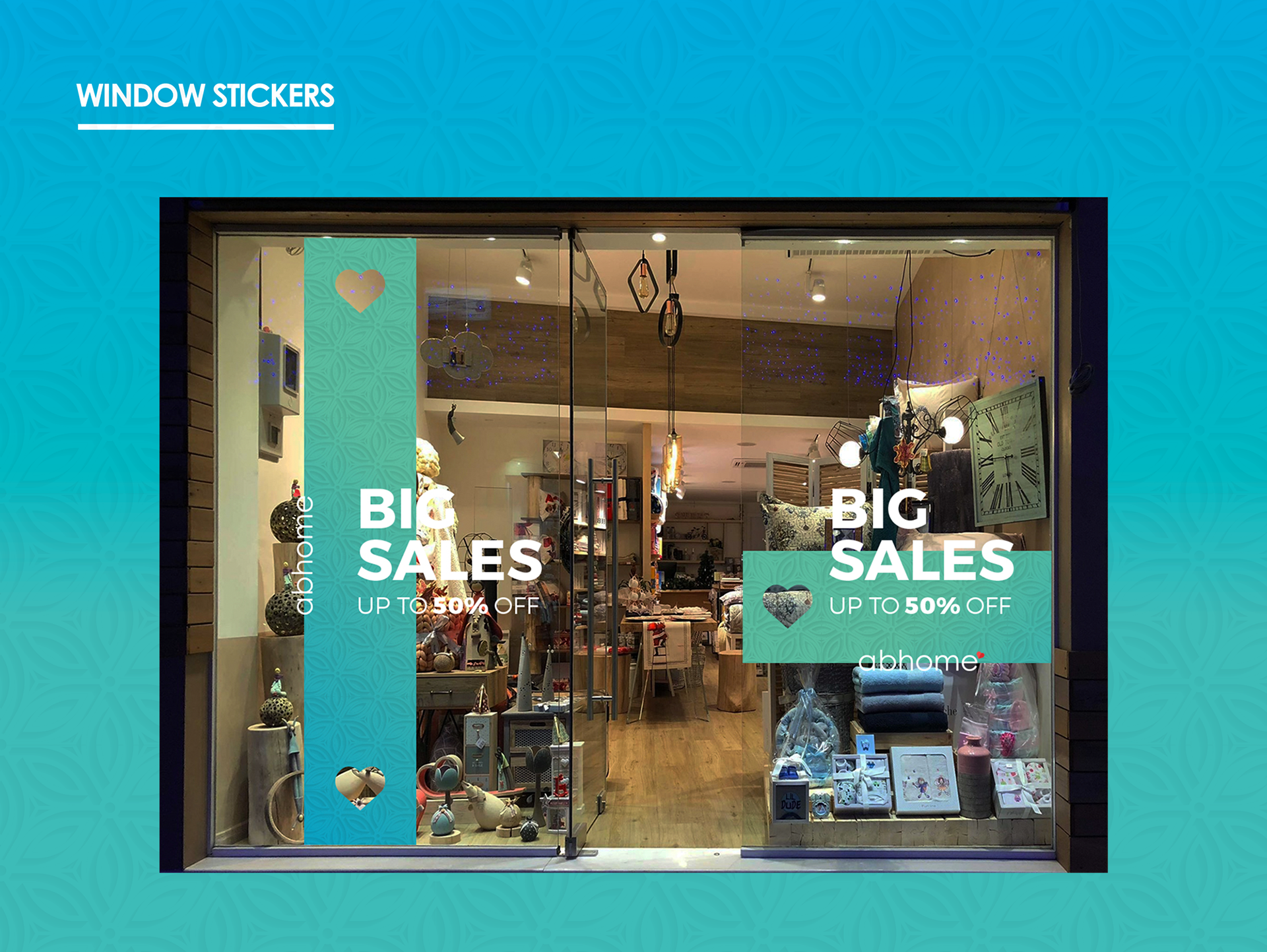
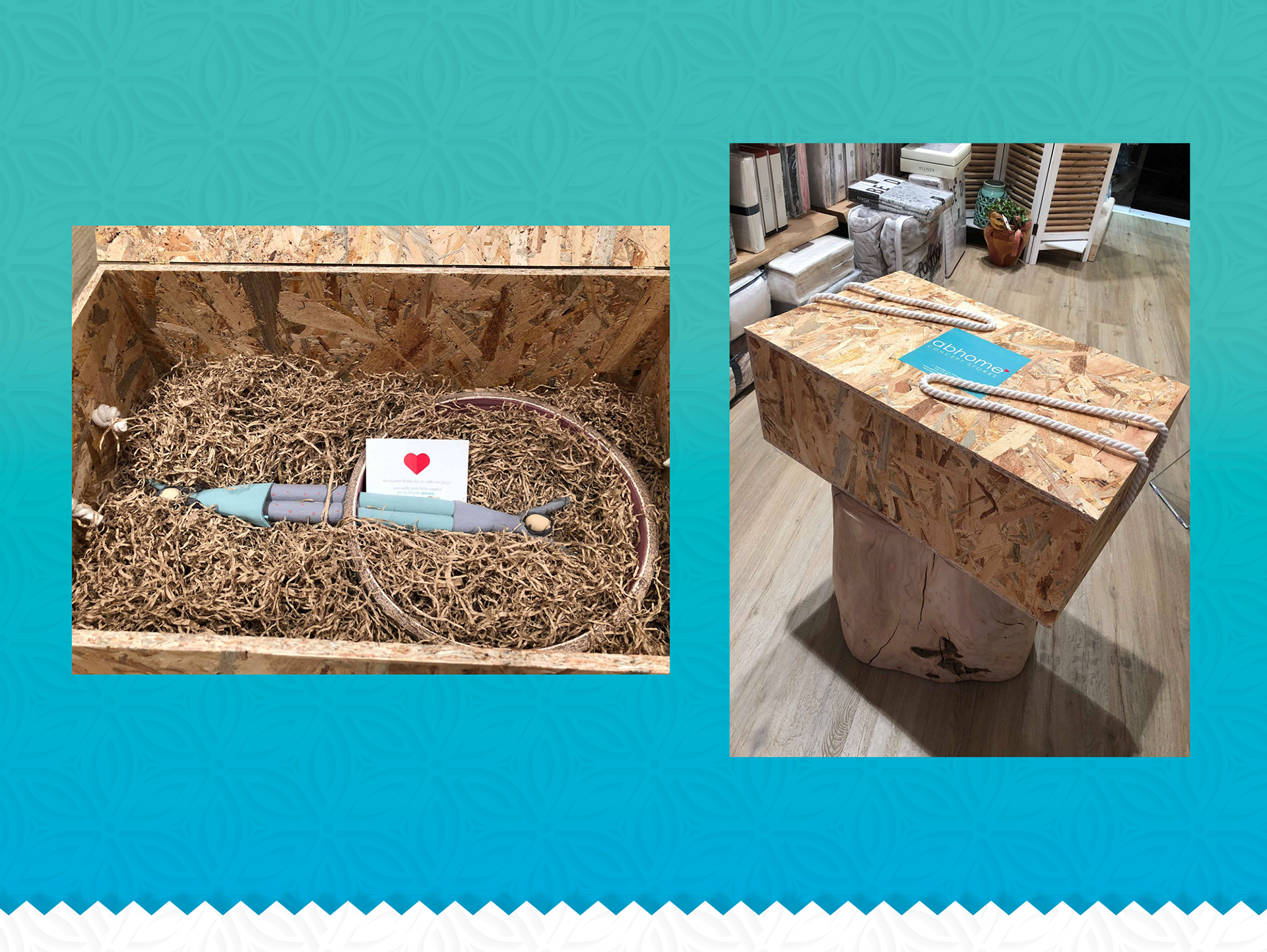
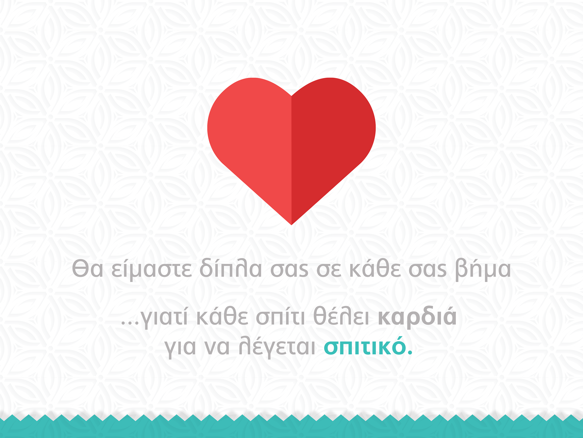
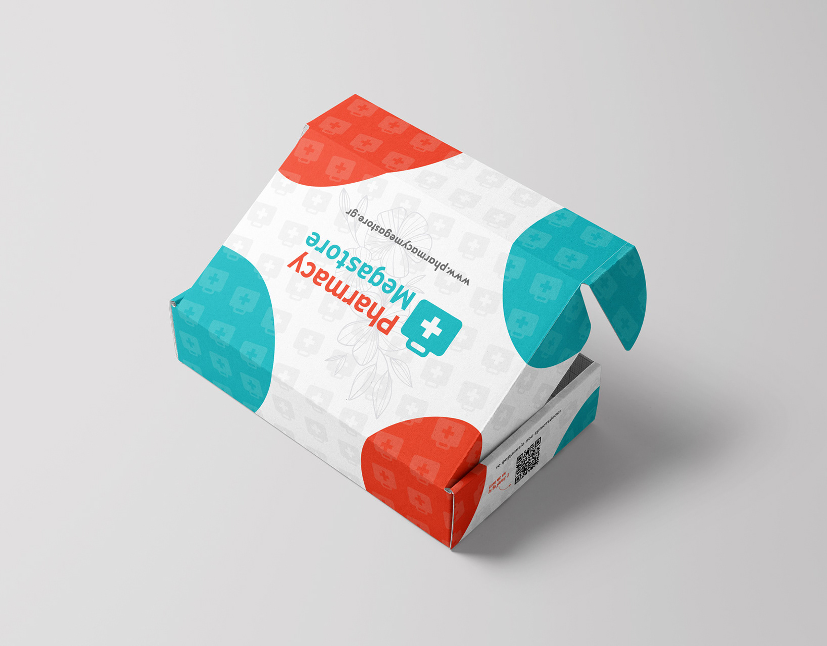
Our journey creating this store’s brand was truly heartwarming. From the logo to the smallest details, the goal was to create a space where every customer feels at home. The heart-shaped logo reflects the idea that “Home is where the heart is,” a message that guides the entire brand identity. The teal and red color palette adds warmth and comfort, helping shape an experience that reminds people that home is a feeling, not just a place.
Our journey creating this store’s brand was truly heartwarming. From the logo to the smallest details, the goal was to create a space where every customer feels at home. The heart-shaped logo reflects the idea that “Home is where the heart is,” a message that guides the entire brand identity. The teal and red color palette adds warmth and comfort, helping shape an experience that reminds people that home is a feeling, not just a place.