Company:
abhome.gr
abhome.gr
My Role:
Graphic Design
Services Provided:
Brand Identity
Copywriting
Year:
2020
Graphic Design
Services Provided:
Brand Identity
Copywriting
Year:
2020
Overview:
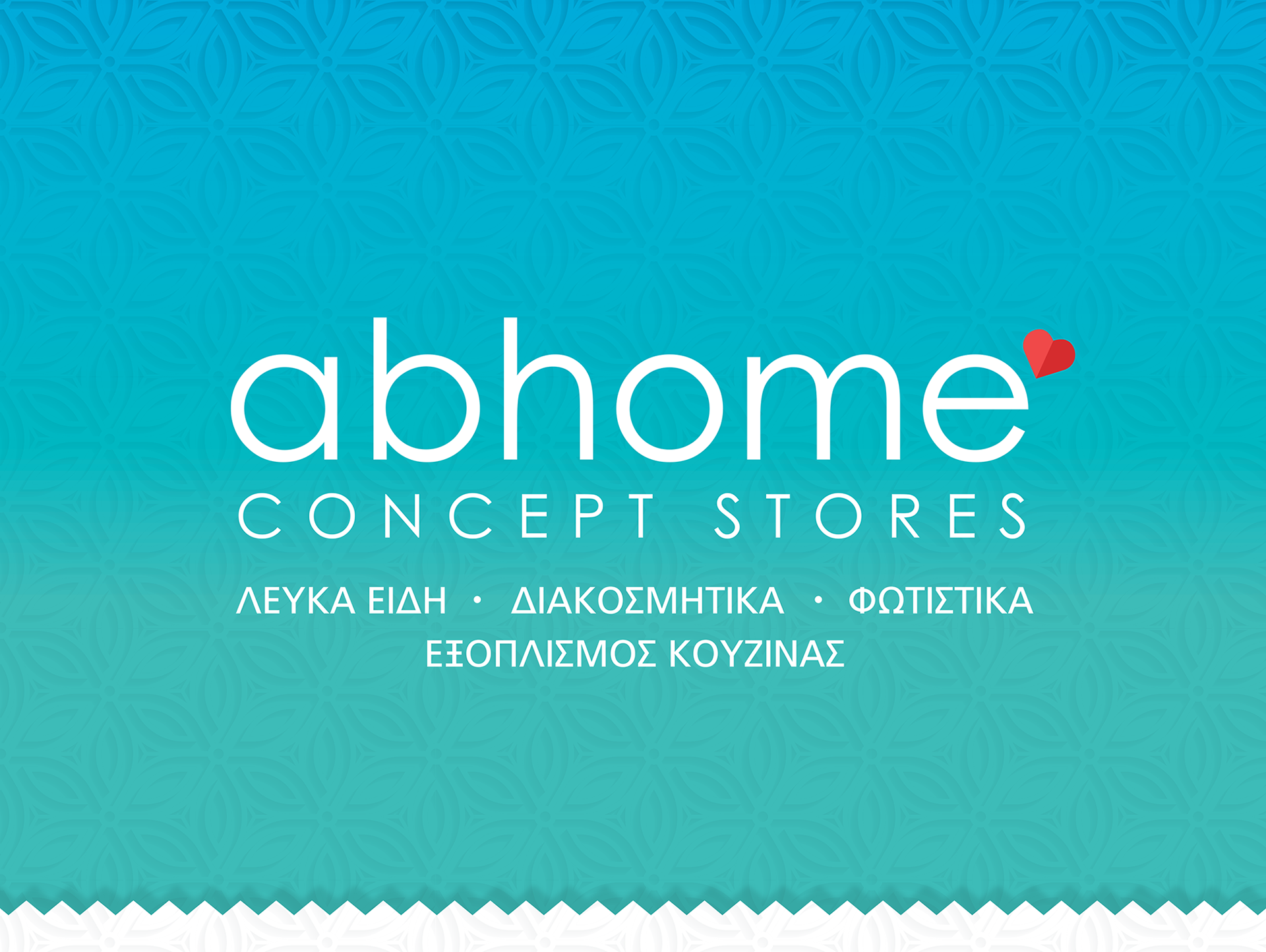
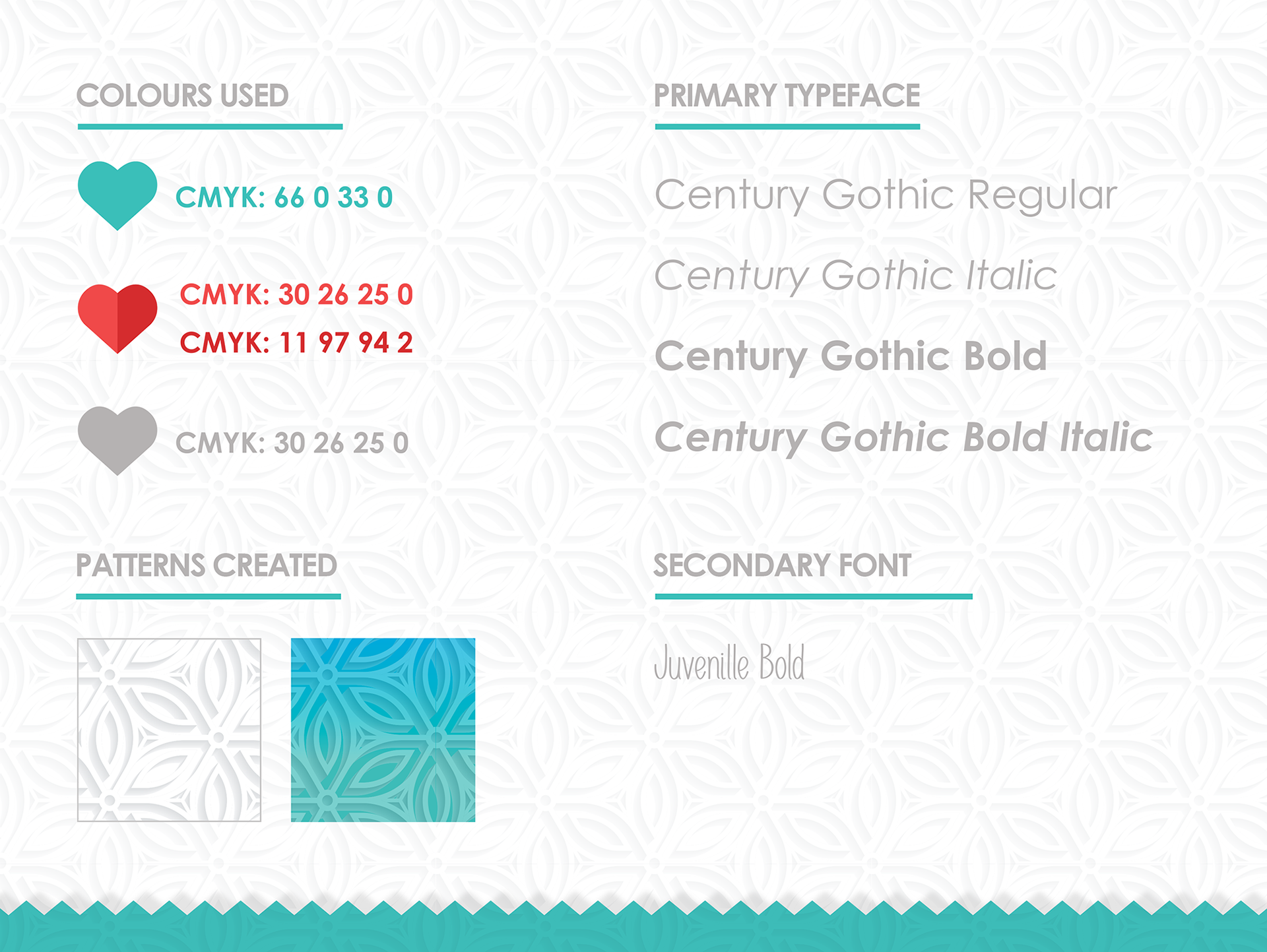
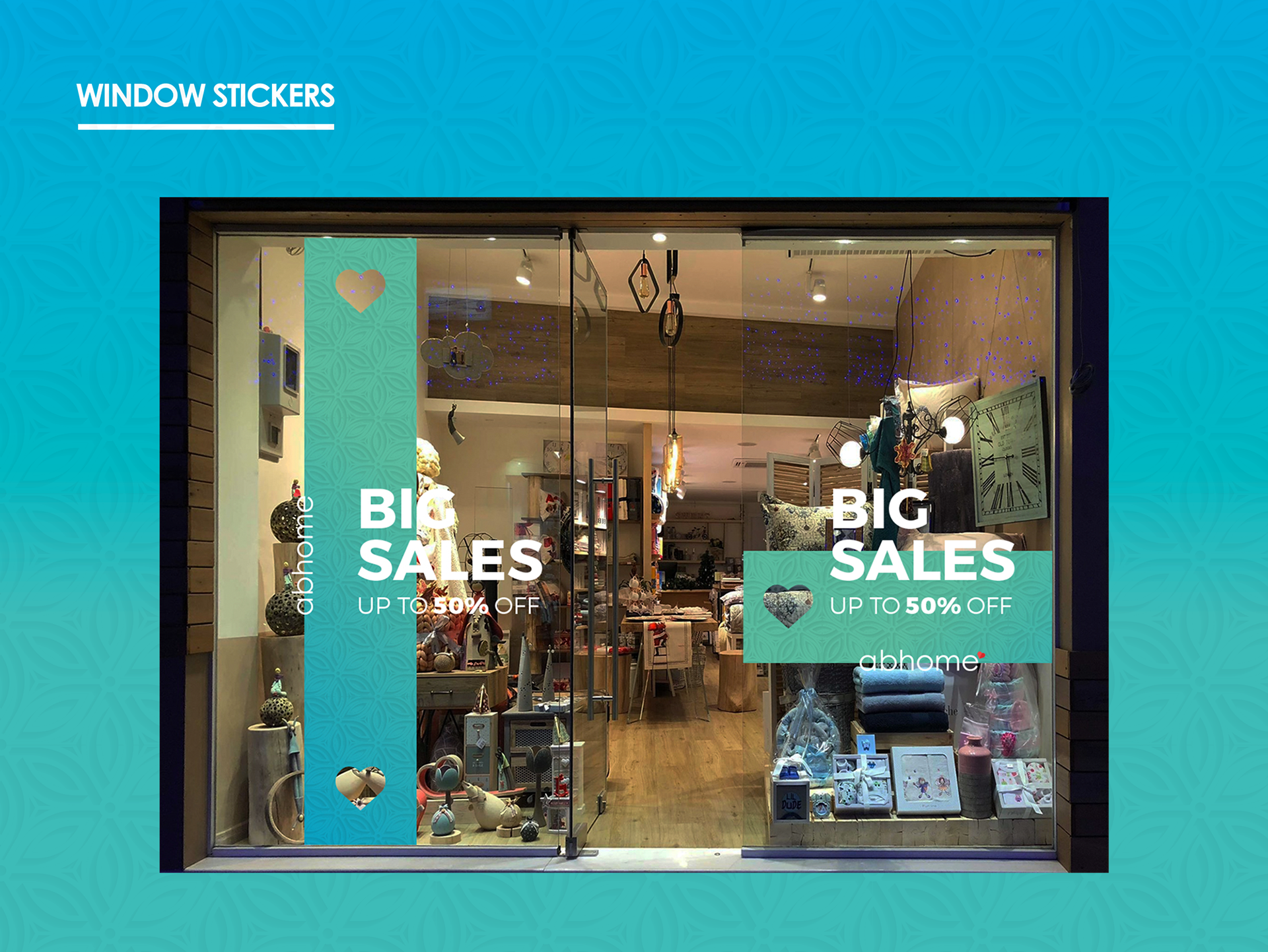
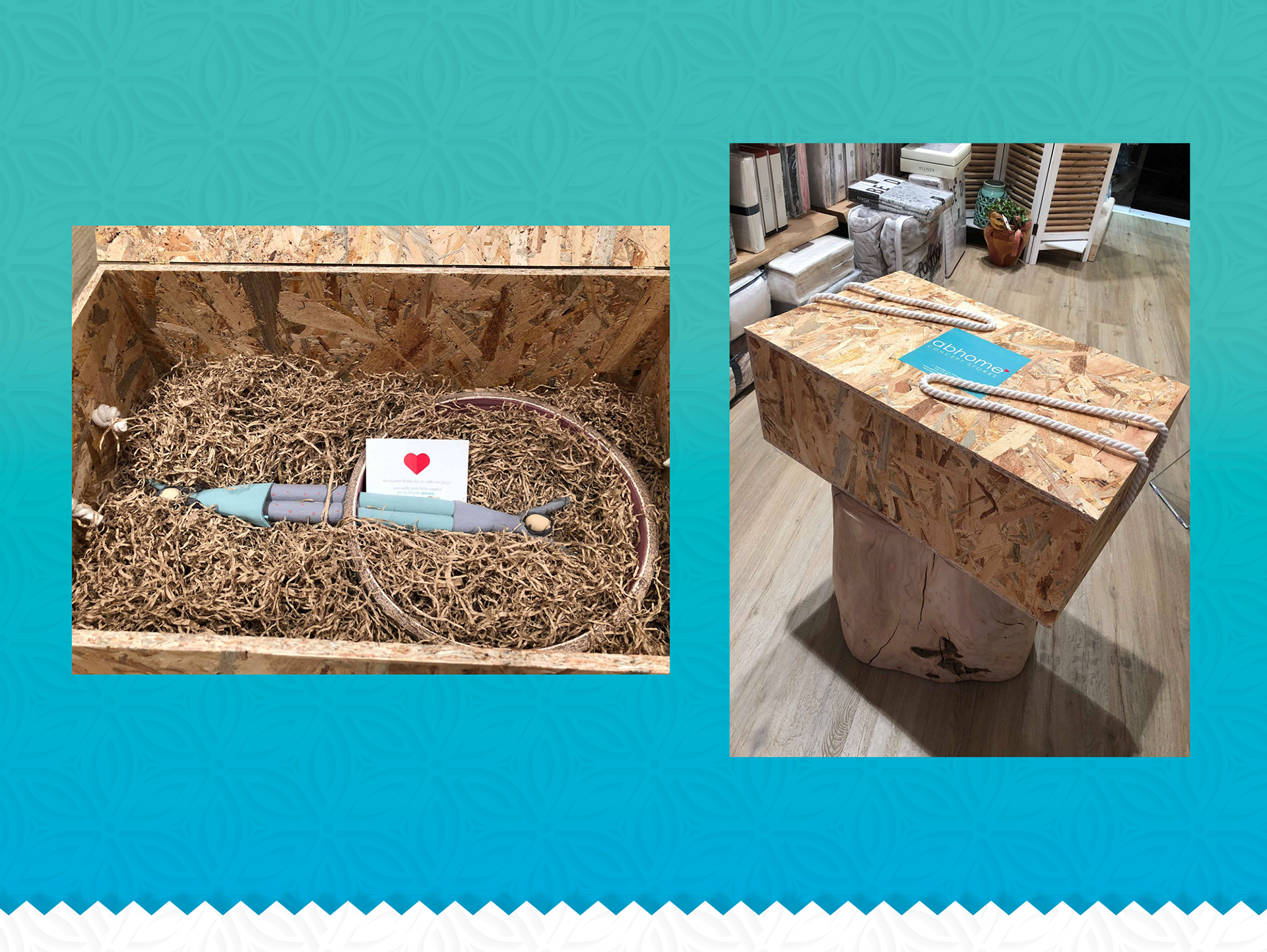
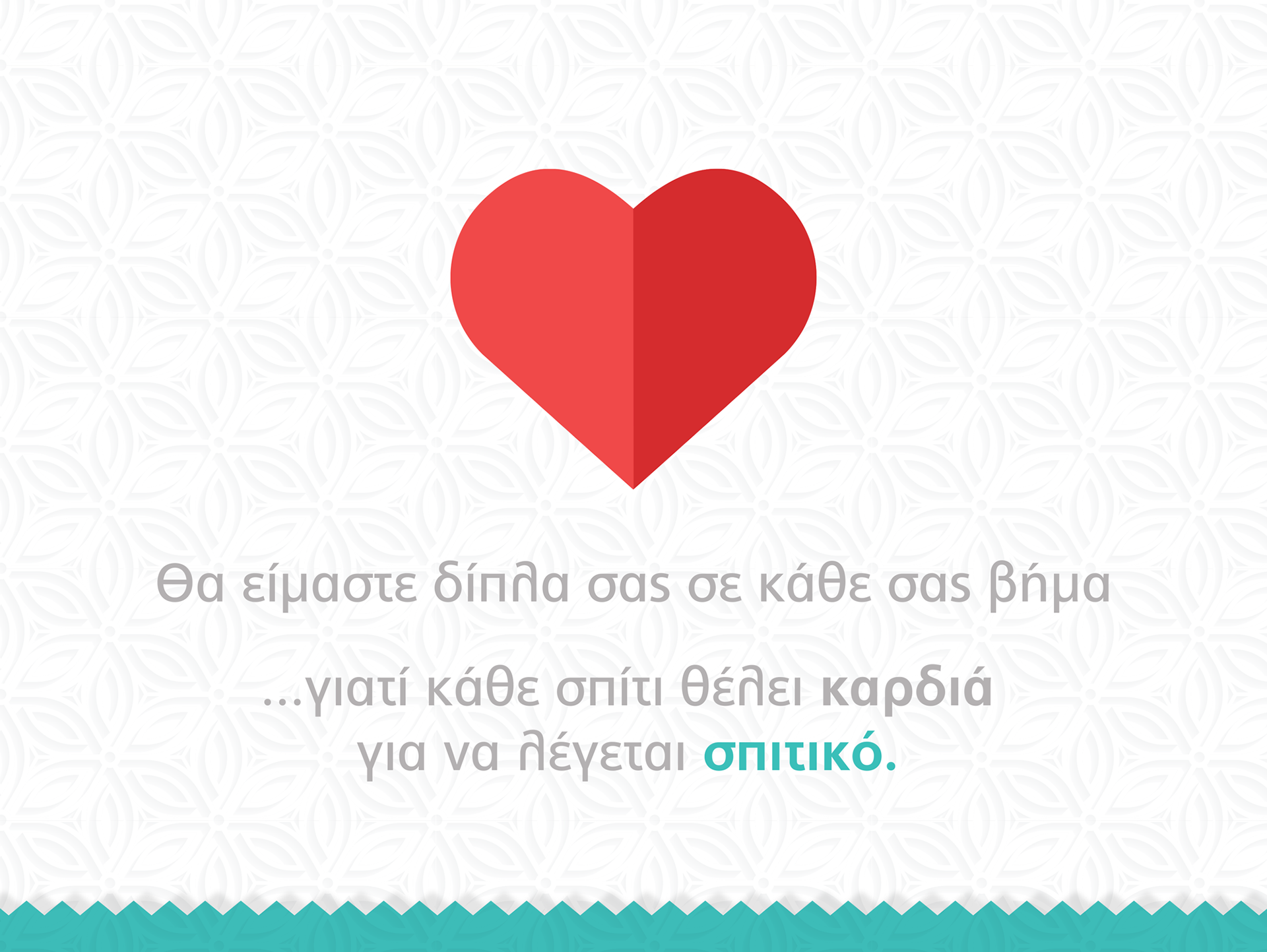
Our journey crafting this store's brand was nothing short of heartwarming. From the logo to every intricate detail, we envisioned a space where every customer feels the sweet embrace of home. The heart-shaped logo represents our commitment to the message "home is where the heart is." This approach extends to every aspect of the brand identity. The teal and red color palette creates a comforting atmosphere, aiming to curate an experience that embodies the sentiment—home is a feeling, not just a place.
Our journey crafting this store's brand was nothing short of heartwarming. From the logo to every intricate detail, we envisioned a space where every customer feels the sweet embrace of home. The heart-shaped logo represents our commitment to the message "home is where the heart is." This approach extends to every aspect of the brand identity. The teal and red color palette creates a comforting atmosphere, aiming to curate an experience that embodies the sentiment—home is a feeling, not just a place.